3.3.1 Colour and size
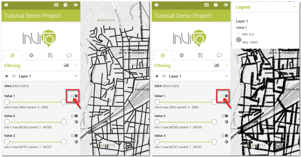
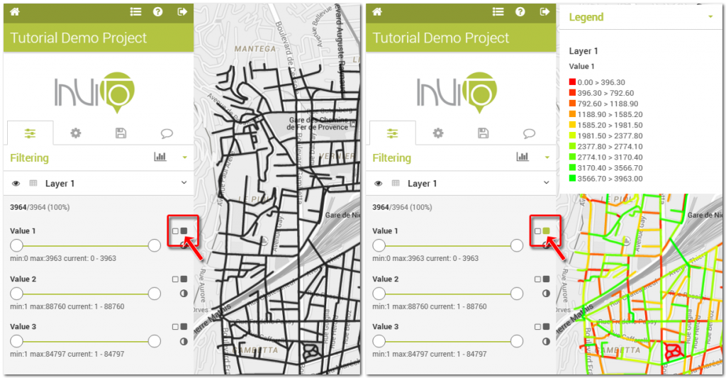
Data visualisation can be customised by the user clicking on the following icons:
![]()
Weight feature’s stroke with thickness dependent on this property. Clicking on this button you can modify the thickness of lines or the radius of points.
![]()
Fill feature’s area with color dependent on this property. Clicking on this button you can enable and disable the colour map style associated to each layer.


![]()
The intersection of the colour style from one layer with the thickness relative to another layer, provide interesting opportunities for reading maps and increasing the knowledge which can be achieved from data visualisation. In this case, you can visualise the colour scale according to a field (value 2) and the size according to another field (value 3). Such a visualisation can provide a number of outcomes. For example black and thicker lines correspond to the maximum values of two fields (value 2 and 3), while thinner white lines refer to minimum values.